


Nano Icons is the fastest way to render icons in React Native. Point it at a folder of SVGs and get blazing-fast, native icon rendering with near-zero overhead. It works great for any app that uses icons, and is at its best when the same small symbols appear many times on screen — row icons in a list, tab bars, inline badges. See benchmarks →
react-native-svg — It works, but it wasn’t designed for icons. Every SVG component spins up a full React subtree that gets parsed, reconciled, and laid out on each mount. One icon is fine. Fifty in a scrollable list and your UI starts paying for it (read more).
expo-image and similar — A better choice for complex vector graphics, but each image goes through its own rasterization pipeline. That’s not optimized for drawing many copies of the same small symbol, and the per-image overhead makes it better suited for richer graphics than tiny repeated icons.
react-native-vector-icons — Already font-based, so rendering is fast. Great if you’re using a bundled icon pack like MaterialIcons or FontAwesome. But if you need your own custom icons, you’re back to managing font files manually with external tools — exactly the workflow Nano Icons eliminates.
At build time, your SVGs are automatically converted into an optimized icon font. At runtime, each icon renders as a single native text glyph stack — bypassing React’s component tree entirely. The result is dramatically less work per icon, especially in screens with many repeated symbols: lists, tab bars, buttons, inline badges. Drop your SVGs in a folder. Use them as a fully typed component by name. That’s it 🔬⚡️
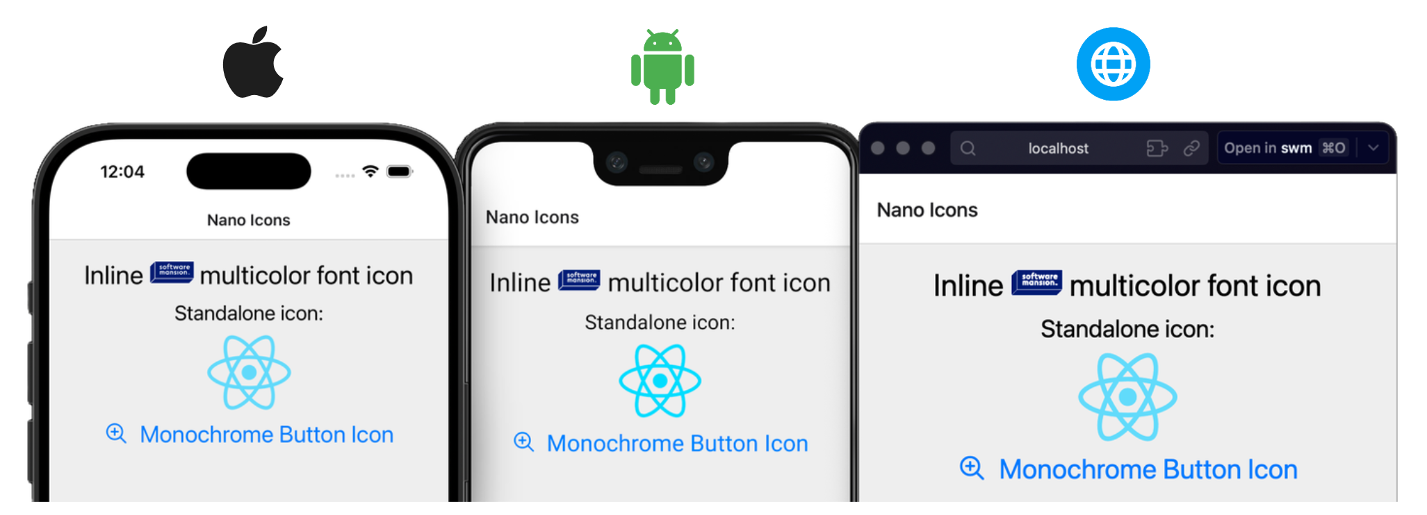
- 🧩 Platforms Supported
- 🚀 Quick Start
- 🎨 Multicolor Icons
- 📊 Performance
⚠️ Known Limitations- 🔧 Font Generation Pipeline
- 🤝 Contributing
- License
- React Native 0.74+ (New Arch Only)
- iOS 15.1+
- Android API 24+
- Web
- Expo Go
- tvOS 15.1+
npm install react-native-nano-iconsCreate a directory for your icon set and place your .svg files in it. Only *.svg format is supported.
assets/icons/my-icons/
├── heart.svg
├── search.svg
├── flag-us.svg
└── ...
File names become icon names: heart.svg is rendered with <Icon name="heart" />.
The library uses an Expo Config Plugin to hook into the prebuild phase. This automatically generates the .ttf and corresponding glyphmap files and links them to the native iOS/Android project's assets.
app.json
{
  "expo": {
    "plugins": [
      [
        "react-native-nano-icons",
        {
          "iconSets": [
            {
              "inputDir": "./assets/icons/my-icons"
            }
          ]
        }
      ]
    ]
  }
}
All iconSets Entry Plugin Options
The plugin accepts an object with an iconSets array, allowing you to generate multiple distinct fonts in a single build.
| Property | Type | Required | Default | Description |
|---|---|---|---|---|
inputDir |
string |
Yes | — | Path to the directory containing your .svg files (e.g., ./assets/icons/ui). |
fontFamily |
string |
No | Folder Name | The name of the generated .ttf and .glyphmap.json files. If omitted, the name of the inputDir folder is used (e.g., ui). The font family registered at runtime is glyphMap.m.f, which appends a short build hash (e.g. ui-1a2b3c4d) so every build of the set is distinct. |
outputDir |
string |
No | ../nanoicons |
Path where the .ttf and .json artifacts will be saved. Defaults to a sibling nanoicons folder relative to the input. |
upm |
number |
No | 1024 |
Units Per Em. Defines the resolution of the font grid. |
startUnicode |
string |
No | 0xe900 |
The starting Hex Unicode point for the first icon glyph. |
linking |
'static' | 'dynamic' |
No | 'static' |
Delivery mode for the generated TTF. 'static' bundles it into the native app. 'dynamic' excludes it from native linking so the host app can deliver it at runtime (i.e. via OTA update). See Dynamic linking. |
web |
boolean |
No | false |
Also emit <fontFamily>.woff2 into outputDir, rebuilt together with the .ttf on every change. It is never linked natively; link it on web like any other web font. |
Default Dir Path Behavior
If you do not specify an `outputDir` or `fontFamily`, the library attempts to keep your project organized by creating a sibling folder.- Input:
./assets/icons/user - Resulting Output:
./assets/icons/nanoicons/user.ttf&user.glyphmap.json
Bare apps don't have a prebuild step, so you run the same pipeline via the CLI:
-
Config – Add a
.nanoicons.jsonwith the sameiconSetsshape as the Expo plugin (see options above). Paths in it are relative to the app root..nanoicons.json example
{ "iconSets": [ { "inputDir": "./assets/icons/my-icons" } ] } -
Build and link – From the app root run:
npx react-native-nano-icons
If the config lives elsewhere in the app, pass it:
--path path/to/.nanoicons.json. From outside the app (for example a monorepo root), pass the app folder:--path apps/mobile. A folder with apackage.jsoncounts as the app, so the CLI reads the config, builds and links there.This works exactly like the config plugin, removing any necessity for manual Xcode/Android Studio font linking steps.
Tip
Run EXPO_DEBUG=1 npx expo prebuild or npx react-native-nano-icons --verbose to get font build-time logs.
Add the plugin to your Metro config to get hot reload for your icons: edit an SVG and the running dev app picks up the new glyph, with no native rebuild or CLI run.
// metro.config.js
const { getDefaultConfig } = require('expo/metro-config');
// or require('@react-native/metro-config') by React Native Community
const { withNanoIcons } = require('react-native-nano-icons/metro');

const config = getDefaultConfig(__dirname);

// Your modifications to the config

module.exports = withNanoIcons(config);
Production builds are not affected — the fonts are linked exactly as configured, static or dynamic. The plugin uses the config from the steps above to speed up development process and experience.
Note
Hot reload needs a development build; Expo Go cannot register fonts at runtime. Before a web export, run the font step as usual (CLI or expo prebuild).
Note
In Expo Go, icons are rendered using a regular <Text> fallback so you can iterate quickly. You will need to link the font manually via the already included expo-font library, keyed by glyphMap.m.f. Once you move to a development build, the library automatically switches to the native component implementation. Remember to remove any expo-font-related icon font setup after the switch.
Note
With web: true, the my-icons set also gets assets/icons/nanoicons/my-icons.woff2 next to its .ttf. Link it on web like any regular font, named my-icons. If you want to require() it through Metro (e.g. with expo-font), add this to metro.config.js:
config.resolver.assetExts.push("woff2");import { View, Text } from 'react-native'
import { createNanoIconSet } from "react-native-nano-icons";
// auto-generated during build in outputDir
import glyphMap from "./assets/icons/nanoicons/my-icons.glyphmap.json";
export const Icon = createNanoIconSet(glyphMap);
export default function App() {
return (
<View>
<Icon name="heart" size={24} color="tomato" />
{/* Icons work inline with text */}
<Text>
Tap <Icon name="heart" size={12} color="tomato" /> to save
</Text>
</View>
);
}| Prop | Type | Default | Description |
|---|---|---|---|
name |
string |
(required) | Icon name — corresponds to the original SVG filename. Fully typed from the glyphmap. |
size |
number |
12 |
Icon size in points. |
color |
ColorValue | ColorValue[] |
Glyphmap defaults | Single color applied to all layers, or per-layer color array. If the array is shorter than the number of layers, the last color is repeated. |
allowFontScaling |
boolean |
true |
Whether the icon size respects the system accessibility font scale. |
style |
ViewStyle |
— | Style applied to the icon container. |
accessible |
boolean |
— | Override the default accessibility behavior. |
accessibilityLabel |
string |
Icon name |
Label announced by screen readers. Defaults to the icon name. |
accessibilityRole |
AccessibilityRole |
"image" |
Accessibility role. Defaults to "image" so the icon is not misinterpreted as text. |
testID |
string |
— | Test identifier for e2e testing frameworks. |
ref |
Ref<View> |
— | Ref to the underlying native view. |
TL;DR the default static linking is best for most use cases as it does not affect JS bundle size at all, but if you have an OTA updates workflow and make changes to your icons frequently, you can opt out of native bundling and register a particular iconSet font at runtime explicitly.
By default, generated TTFs are bundled into the native app at build/link time. Set linking: 'dynamic' to opt out: the build still produces the .ttf and .glyphmap.json, but then OTA workflows will ship icon outside the native binary - you deliver the file and the library will register it at runtime.
Config
{
  "iconSets": [
    {
      "inputDir": "./assets/icons/dynamic-ota-icons",
      "linking": "dynamic"
    }
  ]
}
Note
You can mix both linking modes in the same config — some icon sets can be statically bundled and others delivered dynamically. Each entry in iconSets is independent.
Runtime
Pass the font as the second argument to createNanoIconSet. The library registers it under the family name at runtime.
import { createNanoIconSet } from "react-native-nano-icons";
import glyphMap from "./dynamic-ota-icons.glyphmap.json";

export const Icon = createNanoIconSet(glyphMap, require("./dynamic-ota-icons.ttf"));
// or: createNanoIconSet(glyphMap, { uri: "https://cdn.example.com/remote-nano-icons.ttf" })
Note
In Expo Go, the native font loader is unavailable, but you can still see real icons by loading the font manually via expo-font — use the value of glyphMap.m.f as the family name key. Once you move to a development build, the library registers the font automatically and you can remove the expo-font setup.
If a dynamic glyphmap gets no font, its icons render blank until one is registered under
glyphMap.m.f(with a dev warning).
The build script detects changes in path and contents of the SVGs in your input directory, in the set's config (upm, safeZone, startUnicode) and in the library version or the versions of the packages it builds fonts with, based on a fingerprint hash. If anything changes (file names, SVG attributes/nodes, config, an upgrade of react-native-nano-icons or of a font-building dependency) or the output font/glyphmap files are deleted, the icon set is regenerated during prebuild or manual script run. The first 8 characters of the fingerprint become part of the runtime font family (glyphMap.m.f), so a rebuilt set never clashes with a previous build that is still bundled in the app.
When your dynamic icons change and you want to ship them via OTA update, you don't need to run a full expo prebuild and native rebuild. Use --dynamic to regenerate only the dynamic sets:
# run from your app root
npx react-native-nano-icons --dynamic
Tip
Using Expo CNG with the app config and expo plugin instead of .nanoicons.json ? Just add --app-config flag to use your plugin input setup instead:
# run from your app root
npx react-native-nano-icons --dynamic --app-config
This reads your config directly from app.json / app.config.js / app.config.ts (no separate .nanoicons.json needed). In a monorepo, run it from the app's folder or point it there with --path <app root>.
The CLI rebuilds only the sets defined with linking: "dynamic", and skips all native linking. Commit the updated .ttf and .glyphmap.json and push your OTA update as usual ☁️ 🚀
Note
A full (non --dynamic) run keeps the native projects in sync with the config: the fonts linked natively are exactly the products of the current static sets. Copies of sets that were switched to dynamic, removed from the config, or rebuilt under a new fingerprint are deleted from ios/nanoicons-fonts, UIAppFonts, and android/app/src/main/assets/fonts. Fonts you added yourself are left alone.
Every icon build is deterministic: the same SVGs, config and toolchain produce the same font identity, and the glyphmap refers to that exact font. At startup the library checks, once per icon set, that this font is available to the renderer, so the app always renders the font its glyphmap refers to. The check fails when the glyphmap in the JS bundle and the font in the app come from different builds, for example after an OTA update that changed icons without a new binary. In development a warning is printed. In every build the issue is recorded:
import { addFontIntegrityListener, getFontIntegrityIssues } from "react-native-nano-icons";

addFontIntegrityListener((issue, status) => {
  // status: "found" | "resolved"
});

getFontIntegrityIssues(); // current issues"found": the set's font is missing or out of date, so its icons render blank. A listener added later receives the current issues immediately."resolved": a font for that set loaded later (for example throughloadFont), and the issue was dropped.
Forward "found" issues to your error monitoring (e.g. Sentry) to catch a bad OTA update.
For every scenario and its message, see FONT_INTEGRITY.md.
At build time, each SVG is split by fill color — every distinct color becomes a separate glyph layer in the font. At render time, layers are stacked on top of each other to reconstruct the original image.
This makes the library well-suited for multicolor icons like country flags, brand logos, or any icon with distinct color regions:
// Renders with the original SVG colors
<Icon name="person" size={52} />

// Override individual layer colors
<Icon name="person" size={52} color={['#DB227F', '#FDA780', '#231B25','#140E19']} />

<Text>
  Inline<Icon name="person" size={32} />person
</Text>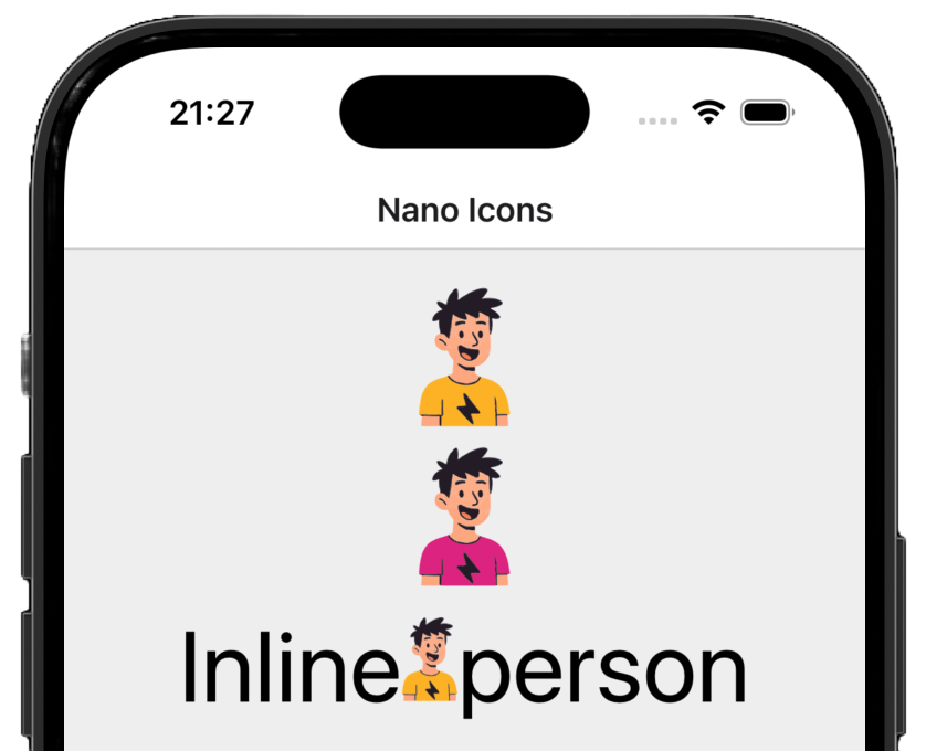
Color prop behavior:
- Single string — applies to all layers.
- Array — each element maps to a layer. If the array is shorter than the number of layers, the last color is repeated.
- Omitted — uses the original SVG colors stored in the glyphmap.
An SVG with many distinct colors (e.g., a detailed vector image with 50 colors) produces at least 50 glyph layers. Each layer is a lightweight text glyph, so this is fine for typical icons (3–10 colors). For highly complex illustrations with dozens of colors, consider using expo-image instead.
Since all of that is actually simple text, you can use your beautiful multicolor SVG designs inline within a regular <Text> component without fighting the layout engine.
Important
You should always verify your icons visually.
Native text engines are among the most optimized rendering pipelines in any OS. Rendering a glyph from a .ttf is synchronous and memory-efficient — unlike SVG, which requires XML parsing, native view tree creation, and Yoga layout calculation per icon instance.
We measured the average time to render a screen with identical set of 1,000 different multicolor icons in a ScrollView on iOS (release build).
| Library | What it is | Rendering approach | Multicolor |
|---|---|---|---|
react-native-svg |
Full SVG renderer | Native view tree per icon | Yes (full SVG spec) |
expo-image |
Universal image component | Async image decode + cache | N/A (raster) |
@expo/vector-icons |
Icon fonts via IcoMoon | Color Table Font glyph rendering | Limited - not supported on Android API level below 33 |
react-native-nano-icons |
Build-time SVG-to-font | Font glyph rendering (layered) | Yes (full API support) |
Note
These libraries serve different primary purposes. expo-image is the go-to image library for photos and remote assets. @expo/vector-icons ships with many popular icon sets built in. react-native-svg handles the full SVG specification with fine-grained attribute control. We compare them here specifically on the use case of rendering many small, static icons.
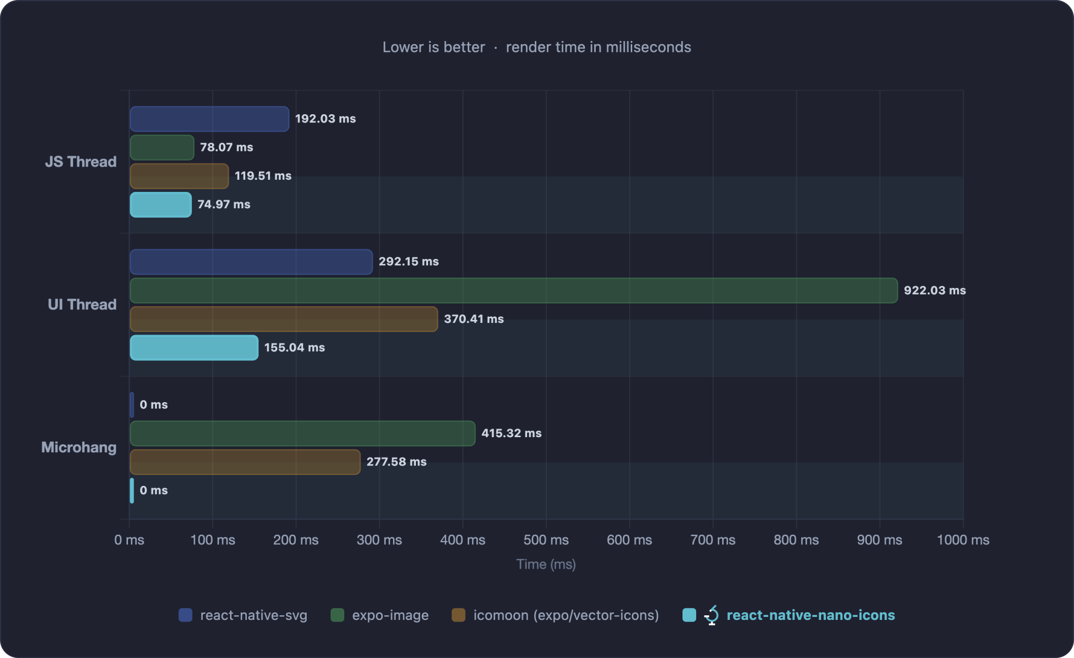
The chart shows time in milliseconds across three phases: JS Thread (JavaScript execution), UI Thread (native rendering on the main thread), and Microhang (main thread stall during initial load that can cause visible UI freezes — see Apple's documentation on hangs).
Note
For full methodology, device specifications, and reproduction steps see BENCHMARKS.md.
- SVG
<filter>and<mask>elements are not supported — font glyphs cannot represent these effects. - Embedded raster images (
<image>elements, e.g. base64-encoded bitmaps inside an SVG) are not supported — only vector geometry can be converted to glyphs. - Only
*.svginput files are supported.

At build time, the pipeline processes your SVG directory through four stages:
- SVG optimization - Simplifies the SVG structure removing unnecessary tags for further processing.
- Geometry flattening — Transforms, clip paths, and overlapping shapes are resolved into simple path-only geometry using a WebAssembly build of
Skia/pathops. - Color layer extraction — Each distinct fill color in an SVG is separated into its own layer.
- Font compilation — Layers are compiled into a standard
.ttffont file, with each layer mapped to a private-use Unicode codepoint. - Glyphmap generation — A compact
.glyphmap.jsonis created, mapping icon names to their codepoints, default colors, and metrics.
At runtime, the native component stacks glyph layers at the same position — one drawGlyphs call per layer via CoreText (iOS) or drawText via Canvas (Android). On the web, icons render as stacked inline <span> elements. In Expo Go, a pure react-native fallback uses stacked <Text> elements.
We want to make contributing to this project as easy and transparent as possible, and we are grateful to the community for contributing bug fixes and improvements. Read below to learn how you can take part in improving react-native-nano-icons.
Repo Navigation
This repository is a yarn workspaces monorepo containing the library package and example apps.
- Library source:
packages/react-native-nano-icons/
- Bare React Native app:
examples/BareReactNativeExample/ - Expo app:
examples/ExpoExample/
We adopted a Code of Conduct that we expect project participants to adhere to. Please read the full text so that you can understand what actions will and will not be tolerated.
react-native-nano-icons is released under the MIT License. See LICENSE for the full text.
Since 2012 Software Mansion is a software agency with experience in building web and mobile apps. We are Core React Native Contributors and experts in dealing with all kinds of React Native issues. We can help you build your next dream product – Hire us.
Made by @software-mansion 💙
