

UI Toolset & Components Library for React Native
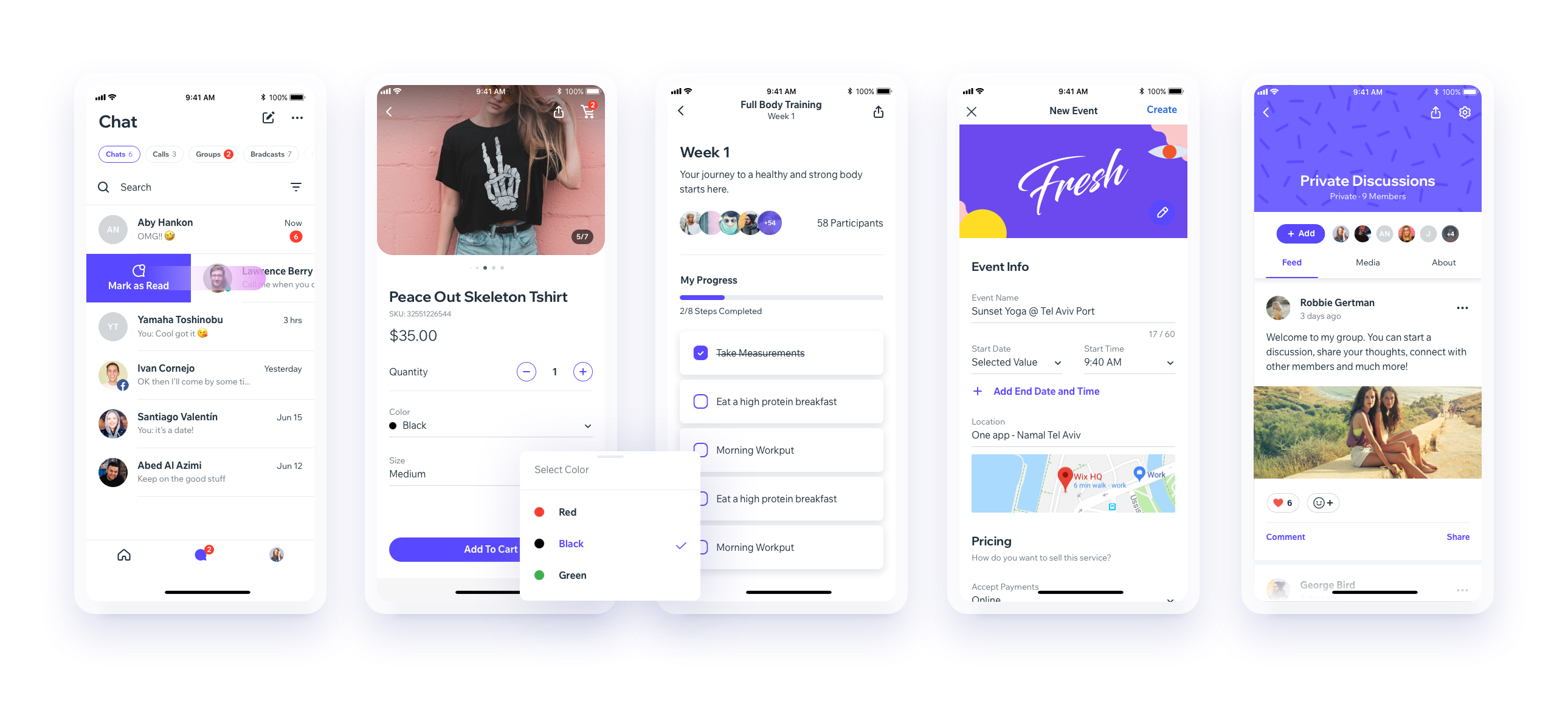




We are working on upgrading our UI Library to support the new React Native Architecture. Currently, we support React Native 0.73, and we plan to support React Native 0.77 next. While we don’t have a timeline yet, this is part of our roadmap.
Download our Expo demo app
(You will need the Expo App)
or open link in your devices
[expo ] exp://exp.host/@vn.chemgio/rnuilib?release-channel=default
See setup instructions here.
See breaking changes
please use react-native-ui-lib
please use react-native-ui-lib@^3.0.0
Load your foundations and presets (colors, typography, spacings, etc...)
// FoundationConfig.js

import {Colors, Typography, Spacings} from 'react-native-ui-lib';

Colors.loadColors({
  primaryColor: '#2364AA',
  secondaryColor: '#81C3D7',
  textColor: '##221D23',
  errorColor: '#E63B2E',
  successColor: '#ADC76F',
  warnColor: '##FF963C'
});

Typography.loadTypographies({
  heading: {fontSize: 36, fontWeight: '600'},
  subheading: {fontSize: 28, fontWeight: '500'},
  body: {fontSize: 18, fontWeight: '400'}
});

Spacings.loadSpacings({
  page: 20,
  card: 12,
  gridGutter: 16
});Set default configurations to your components
// ComponentsConfig.js

import {ThemeManager} from 'react-native-ui-lib';

// with plain object
ThemeManager.setComponentTheme('Card', {
  borderRadius: 8
});

// with a dynamic function
ThemeManager.setComponentTheme('Button', (props, context) => {
  // 'square' is not an original Button prop, but a custom prop that can
  // be used to create different variations of buttons in your app
  if (props.square) {
    return {
      borderRadius: 0
    };
  }
});Use it all together. Your configurations will be applied on uilib components so you can use them easily with modifiers.
// MyScreen.js

import React, {Component} from 'react';
import {View, Text, Card, Button} from 'react-native-ui-lib';

class MyScreen extends Component {
  render() {
    return (
      <View flex padding-page>
        <Text heading marginB-s4>
          My Screen
        </Text>
        <Card height={100} center padding-card marginB-s4>
          <Text body>This is an example card </Text>
        </Card>

        <Button label="Button" body bg-primaryColor square></Button>
      </View>
    );
  }
}